Example 1
Two classes, seven predictors, no missingness. Same coefficients for both classes, just a shift in intercept between the two classes.
Set up the data:
p = 7
k = 2
n = 20
beta = c(0,0,4,0,0,8,0)
set.seed(1)
# X = list(matrix(rnorm(p*n), ncol = p), matrix(rnorm(p*n), ncol = p))
# Y = list(rnorm(n), rnorm(n))
# df = lists_to_data(Y, X)
Xk <- mvtnorm::rmvnorm(n*2, mean=1:p, sigma=diag(1:p)) %>% round(2)
yk <- Xk %*% beta + rnorm(n*2) + rep(c(0,10), each = n) %>% round(2)
df1 = data.frame(y = yk, Xk, class = rep(c("A", "B"), each = n))
Run the mc_reg() function on this data frame
mc1 = mc_reg(df1, class_var = "class", y_var = "y")Plot the results (can have the tuning parameter or the knot number on the x-axis and the scaled or original scale (rescaled) coefficients on the y-axis.)
# plot(mc1, coef_type = "scaled", plot_type = "knot")
# plot(mc1, coef_type = "scaled", plot_type = "lambda")
# plot(mc1, coef_type = "rescaled", plot_type = "knot")
plot(mc1, coef_type = "rescaled", plot_type = "lambda")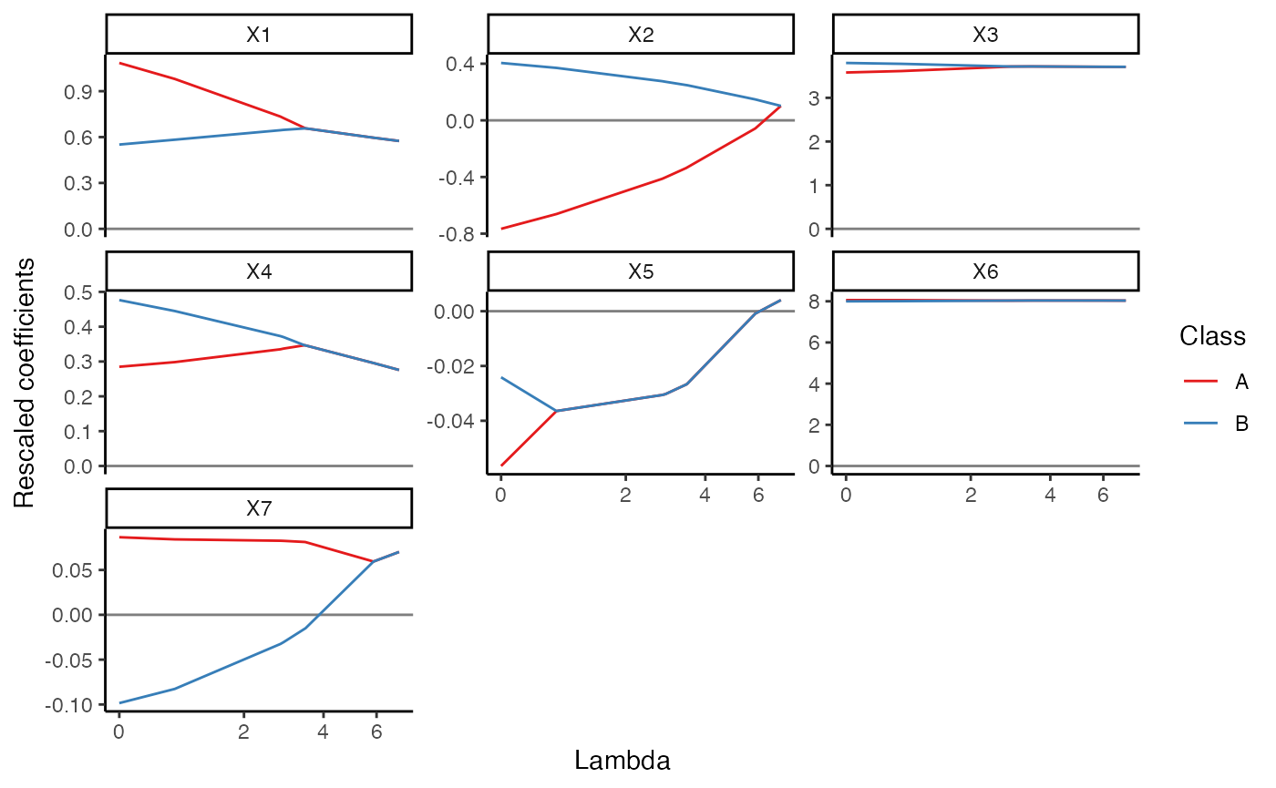
Compare the predictions to the original dependent variable - in this simple case there’s not much meaningful difference between the pooled and separate solutions - both classes had the same slope coefficients (though different intercepts).
mc1$predictions %>%
  ggplot2::ggplot(ggplot2::aes(x = y, y = yhat)) +
  ggplot2::geom_abline() +
  ggplot2::geom_point() +
  ggplot2::facet_grid(class ~ knot, labeller = label_both) +
  theme_bw()
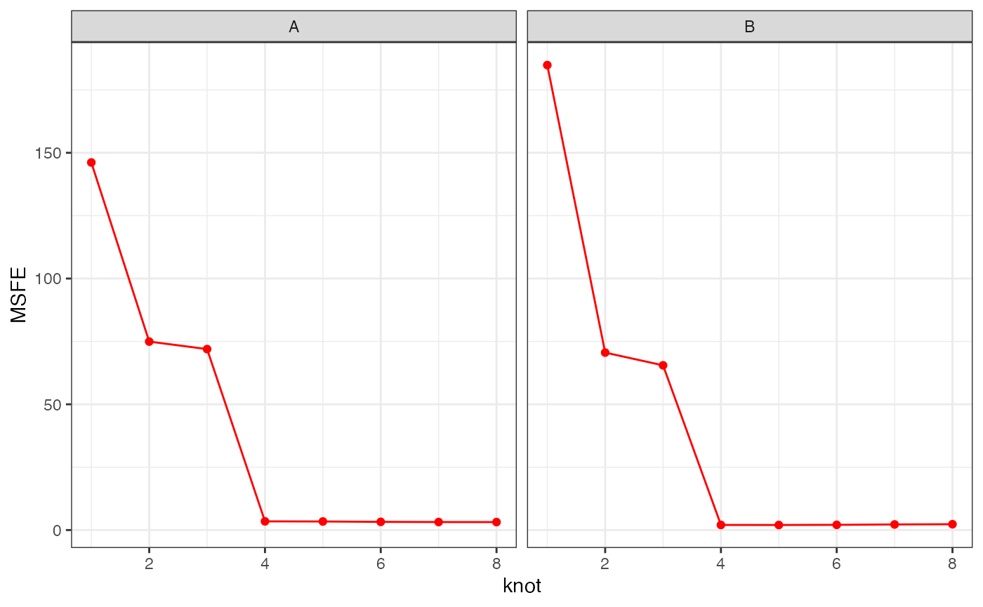
Cross validation
cv1 = mc_cv(mc1)
p1 = cv1$class_knot_summary %>%
  ggplot2::ggplot(ggplot2::aes(x = knot, colour = class)) +
  ggplot2::geom_point(ggplot2::aes(y = MSFE)) +
  ggplot2::geom_line(ggplot2::aes(y = MSFE)) +
  labs(subtitle = "MSFE by class") +
  theme_bw()

p2 = cv1$class_knot_summary %>%
  ggplot2::ggplot(ggplot2::aes(x = knot, colour = class)) +
  ggplot2::geom_point(ggplot2::aes(y = MAFE)) +
  ggplot2::geom_line(ggplot2::aes(y = MAFE)) +
  labs(subtitle = "MAFE by class")+
  theme_bw()

p3 = cv1$knot_summary %>%
  ggplot2::ggplot(ggplot2::aes(x = knot, group = "")) +
  ggplot2::geom_point(ggplot2::aes(y = MSFE), colour = "blue") +
  ggplot2::geom_line(ggplot2::aes(y = MSFE), colour = "blue") +
  labs(subtitle = "Overall MSFE")+
  theme_bw()


p4 = cv1$knot_summary %>%
  ggplot2::ggplot(ggplot2::aes(x = knot, group = "")) +
  ggplot2::geom_point(ggplot2::aes(y = MAFE), colour = "red") +
  ggplot2::geom_line(ggplot2::aes(y = MAFE), colour = "red") +
  labs(subtitle = "Overall MAFE")+
  theme_bw()

cowplot::plot_grid(p1, p3, p2, p4, align = "hv", axis = "tblr")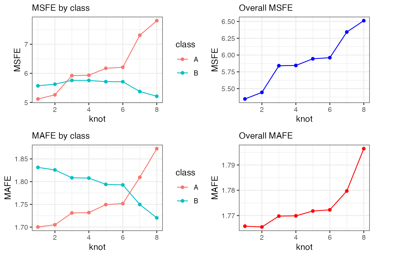
Example 2
Test it out on a slightly more complex example where we have still only 2 classes but the coefficients are different between the two classes.
p = 7
k = 2
n = 50
set.seed(1)
X1 <- mvtnorm::rmvnorm(n, mean=1:p, sigma=diag(1:p)) %>% round(2)
y1 <- X1 %*% c(0,0,6,0,0,8,0) + rnorm(n) + rep(0, each = n) %>% round(2)
X2 <- mvtnorm::rmvnorm(n, mean=1:p, sigma=diag(1:p)) %>% round(2)
y2 <- X2 %*% c(0,0,2,0,0,4,9) + rnorm(n) + rep(10, each = n) %>% round(2)
Xk = rbind(X1,X2)
yk = rbind(y1,y2)
df3 = data.frame(y = yk, Xk, class = rep(c("A", "B"), each = n))
# boxplot(df$y ~ df$class)
# plot(df$y ~ df$X3)
# lm(y ~ ., data = df) %>% summary()
Run the mc_reg() function on this data:
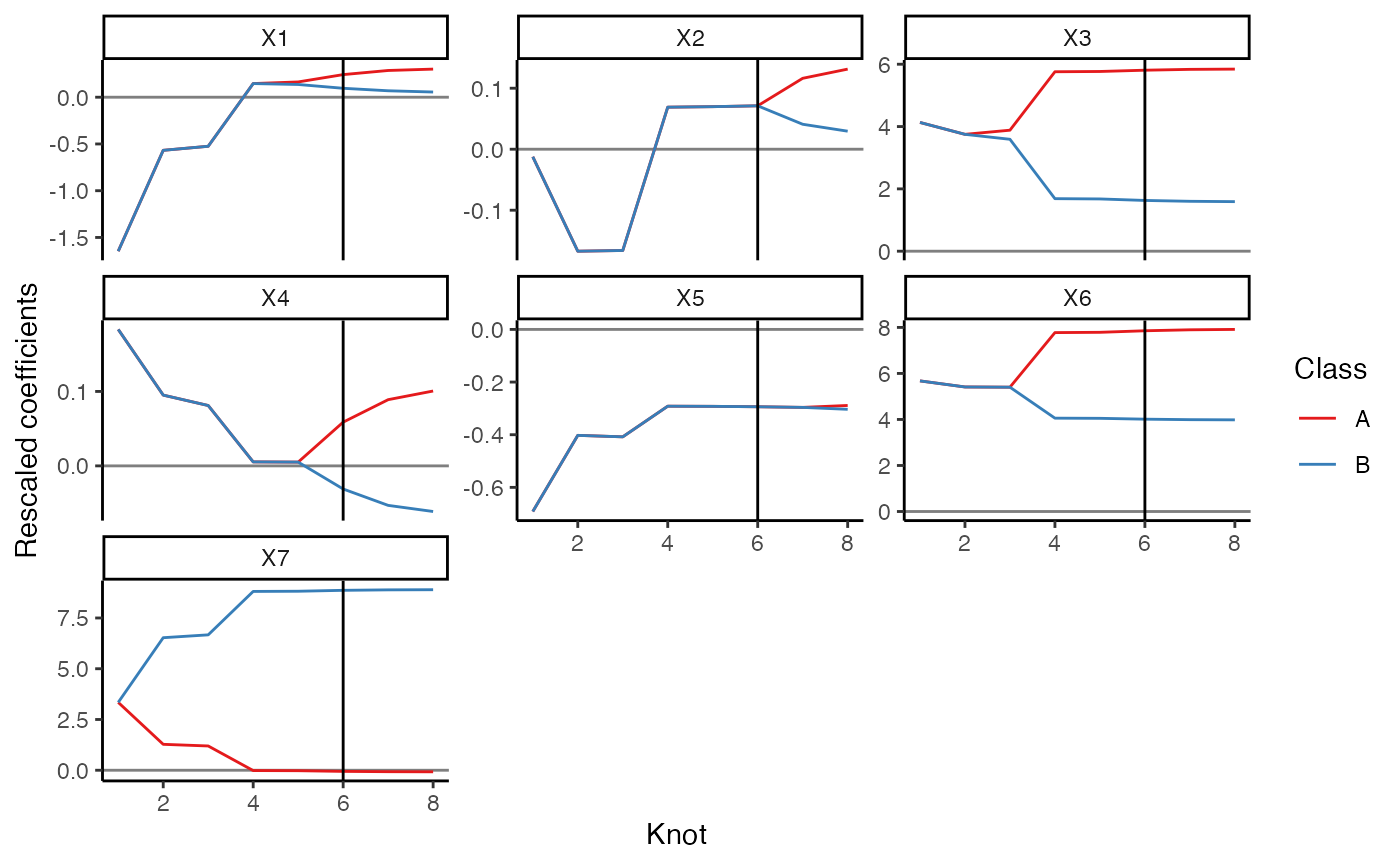
res = mc_reg(df3, class_var = "class", y_var = "y")We can plot the coefficient paths and indicate the knot that gives the minimum AIC:
plot(res) +
  ggplot2::geom_vline(
    xintercept = res$bic$knot[which.min(res$bic$aic)]
  )
If we wanted to, we could look at the absolute differences between the predicted and the actual y for each knot:
res$predictions %>% dplyr::group_by(knot, df) %>%
  dplyr::mutate(
    ydiff = abs(y-yhat)
  ) %>%
  ggplot2::ggplot() +
  ggplot2::aes(x = knot, y = ydiff) +
  ggplot2::geom_point() +
  theme_bw()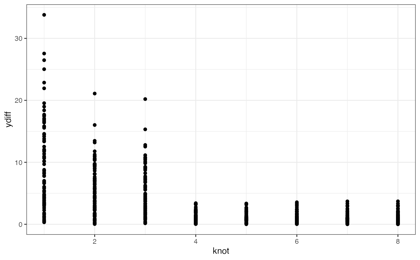
Cross validation
cv3 = mc_cv(res)Looking at the MSFE for each class across the knots:
cv3$class_knot_summary %>%
  dplyr::mutate(knot = as.numeric(knot)) %>%
  ggplot2::ggplot(ggplot2::aes(x = knot, group = class)) +
  ggplot2::geom_point(ggplot2::aes(y = MSFE), colour = "red") +
  ggplot2::geom_line(ggplot2::aes(y = MSFE), colour = "red") +
  ggplot2::facet_wrap(~class) +
  theme_bw()